From macOS to Windows on Surface Pro 4 for a Month
In short, after my Apple rant, Microsoft BeLux challenged me to live and work on a Surface Pro 4 (and some peripherals) for a month!
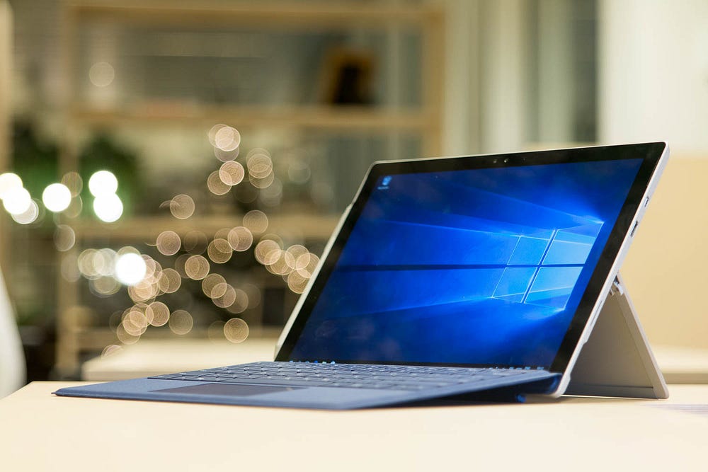
I wrote a little rant about Apple not caring about power users anymore, that kinda took off (thanks, leakers Rudolf van der Ven and Elke De Vilder). Microsoft invited me for a tour of the BeLux headquarters, and to spend a month working on their Surface Pro 4.
I usually try and keep my posts shorts. This is not one of those times.
But it has a lot of pretty pictures.

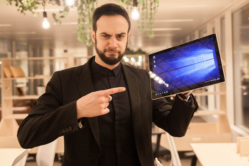
Challenge accepted.
Hold on, challenge accepted? Me, back on Windows? I’m pretty set in my ways and my tools. What about Terminal? Can I install NPM? Run Nginx? Sketch? What’s a good alternative for Coda? Do they have Spotlight? Time Machine? Oh no, what about my beloved Keynote?
How about my iPhone? Can I sync with it? Will my contacts and calendar be up to date? iMessage? Oh your god, what about iMessage?
So this is the story all about how my life got flipped, turned upside-down, and I’d like to take a minute, just sit right there, I’ll tell you how I switched to the Surface Pro 4 and Windows 10 after more than a decade on MacBook Pro’s and MacOS.
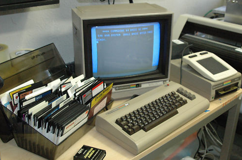
Quick background: Thanks to my dad, I-grew-up in a house where computers were ever-present. One of the very early digital natives. We went from Commodore 64 to DOS-based TANDY systems with those huge floppy drives, moving to 286, 386, 486, Windows 3.11 (‘For Workgroups’, lah dee da), Windows 95, 98 and so on, my last self-built computer was a Pentium D running an optimized Windows XP and SuSE Linux, in 2007-ish.
I got my first Macbook back in 2006, looking for a rock solid system to deejay with (Serato Scratch Live). Being on Windows all those years, I knew it wasn’t an option (back then). I switched permanently in 2009.
I consider myself a “power user”, and speed is everything. I don’t care for animations, emoticons or fancy buttons, and preferably work with an external keyboard and mouse, and a riser or external display.
From my Apple rant: A full keyboard is faster, and so is an external mouse in comparison to the (amazingly good) track pad. I’ll race you any day.
+ What a gorgeous piece of hardware
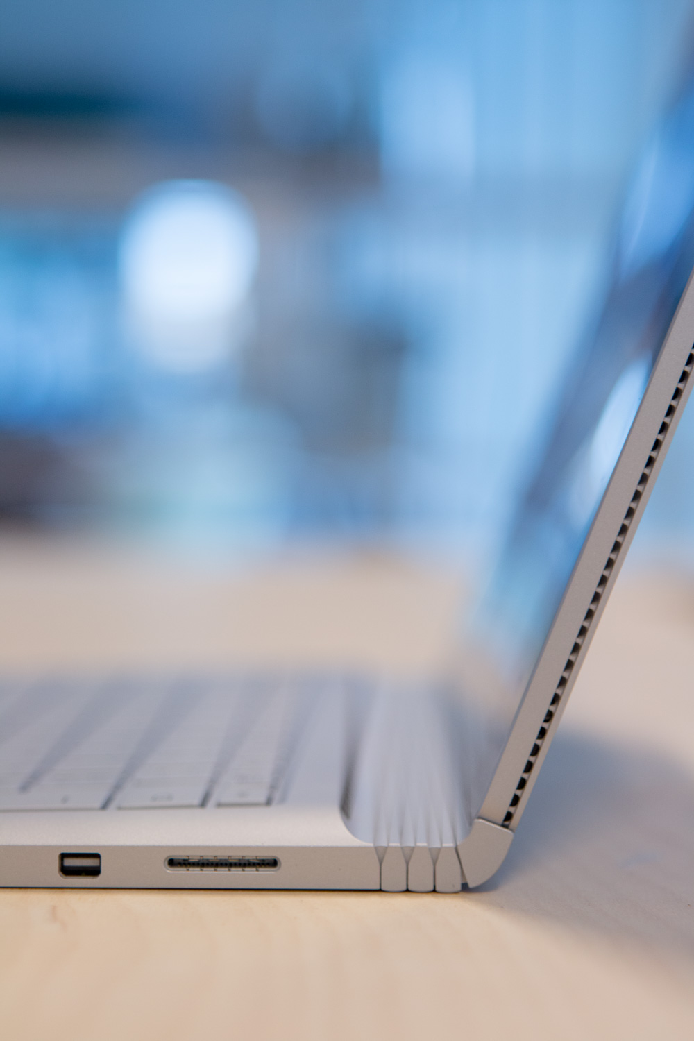
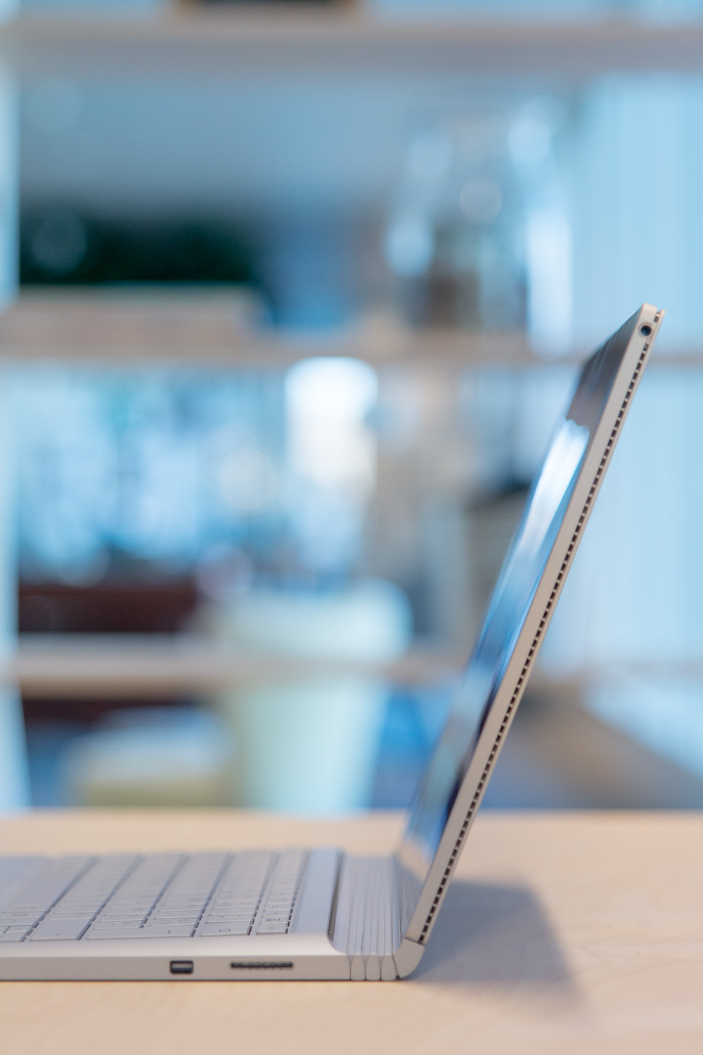
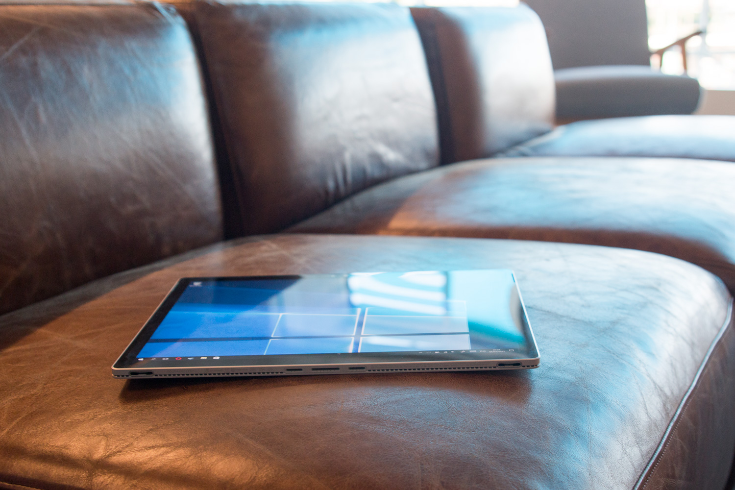
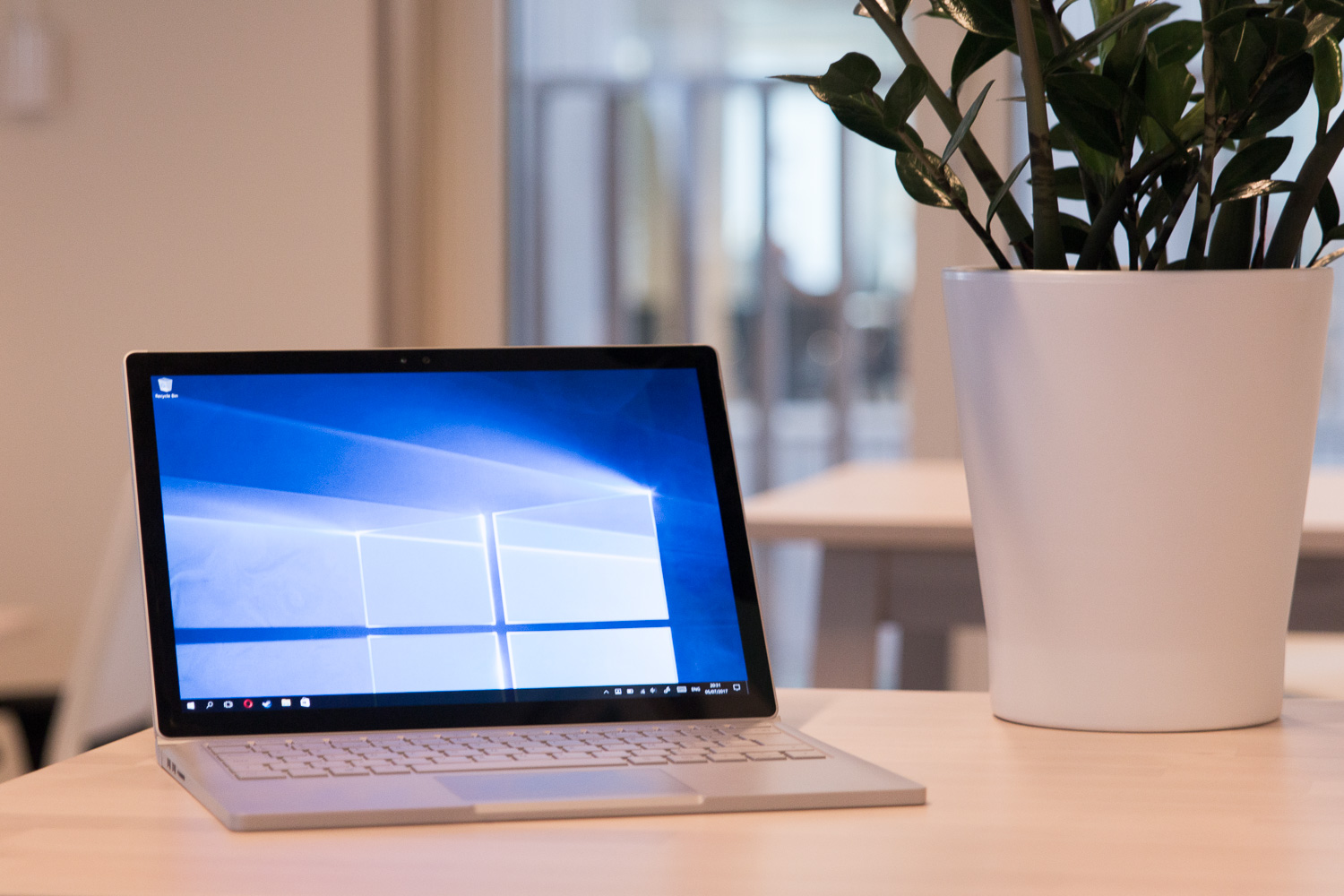
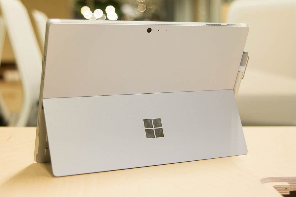
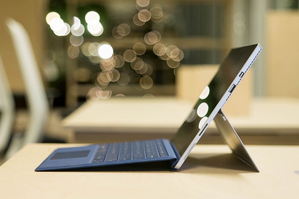
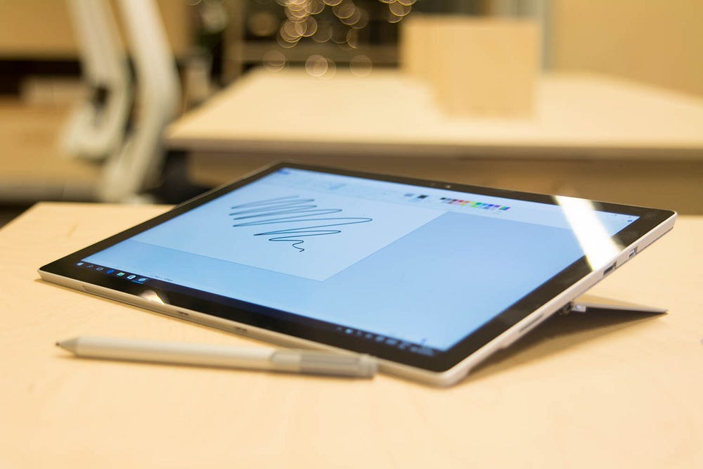
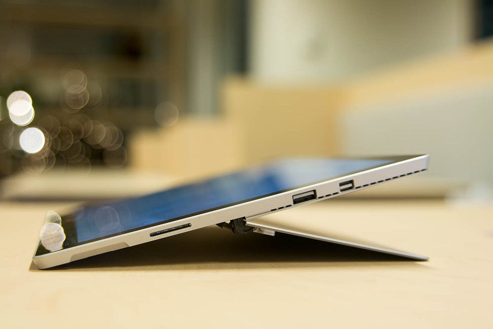
The Surface Pro 4 is a seriously well-designed product. It feels very premium and sturdy, especially the kick-stand which allows the display to be used for sketching and drawing, supporting the lean-on weight. Well done.
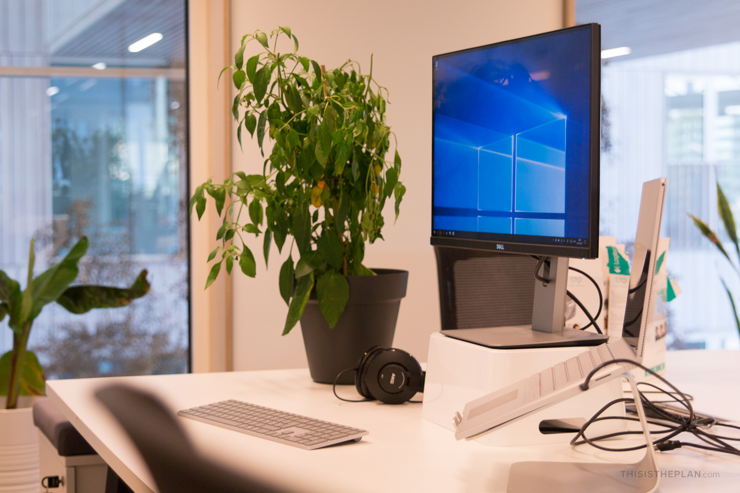
I love the fact that it becomes a different type of device in an instant. Tablet, Laptop with the Type Cover and PC hooked up to display/keyboard/mouse/speakers.
It’s a tablet, it’s a laptop and it’s your desktop computer, all rolled into one. It has a pen to take notes, although I never used it because the Notes app was a bit crap.

+ Made some connections
Now that Apple decided to be a dick to just about anyone with any kind of peripheral, it has some surprising “advantages”…
- USB 3.0 port
Too bad it’s only one port — on my desk, it connects to the hub in my Dell display, to which my external drives and sound interface are connected (and keyboard, on the Macbook). - They do however have a pretty fancy dock/hub, complete with 4 USB ports, 2 display ports, ethernet, audio ánd power. Very nice.
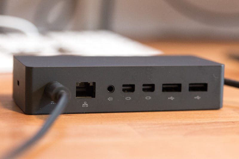
- Mini Displayport
Didn’t even have to switch connectors on my DELL display, sweet. - Headphone jack input
Because, you know, industry standard. - MicroSD slot
I use (full-size) SD frequently for my DSLR, a bit of a bummer, for me.
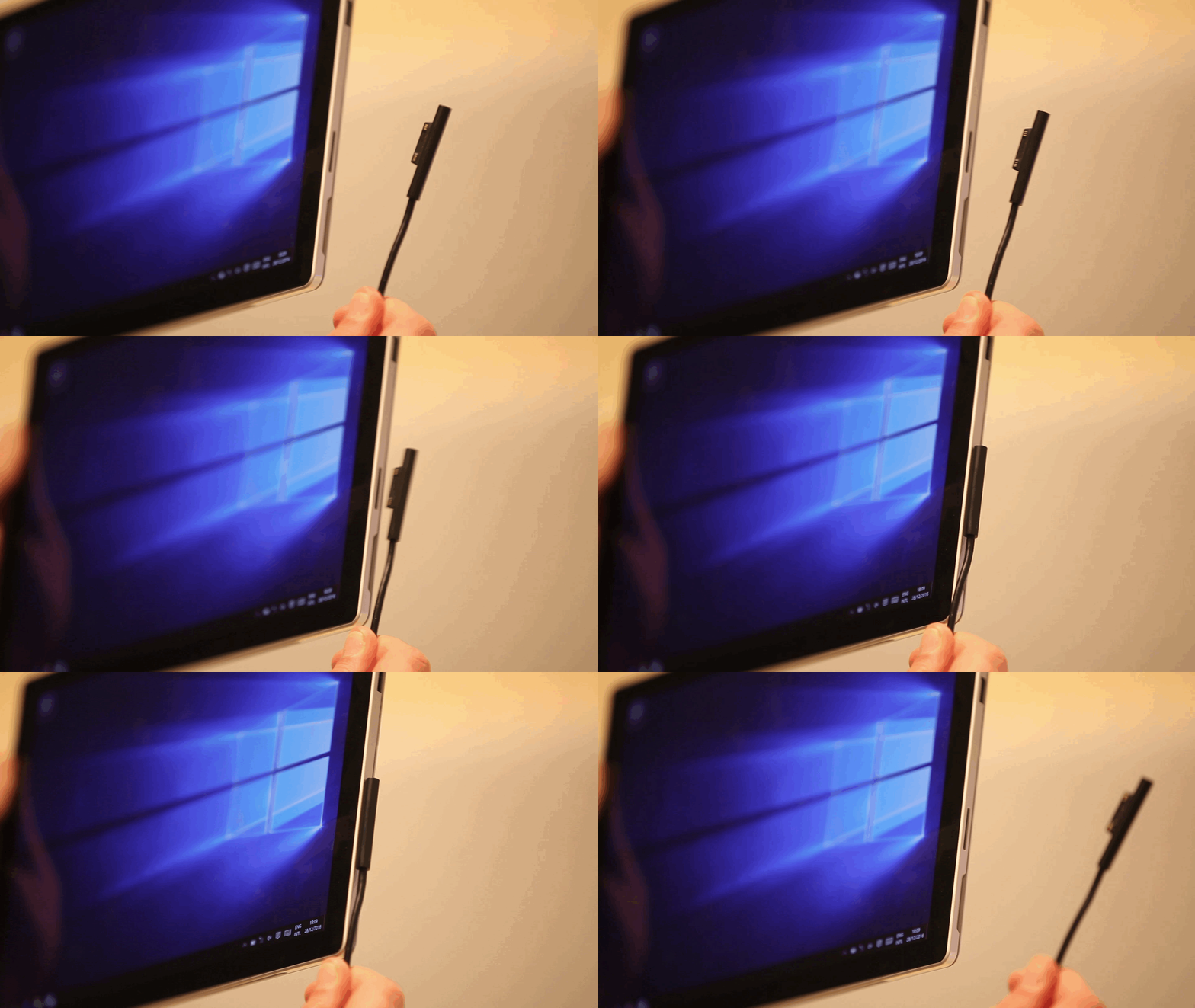
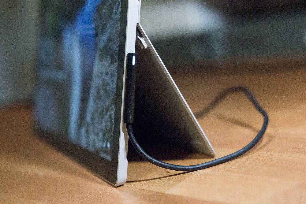
Went USB but that’s just terribly slow. - And, get this: a MagSafe type charging connector! ¯\_(ツ)_/¯
Extra points: the adapter even has an USB port for charging. Well played.
+ Type Cover
The cover serves to protect display and doubles as a surprisingly good keyboard. It snaps on magnetically and firmly.
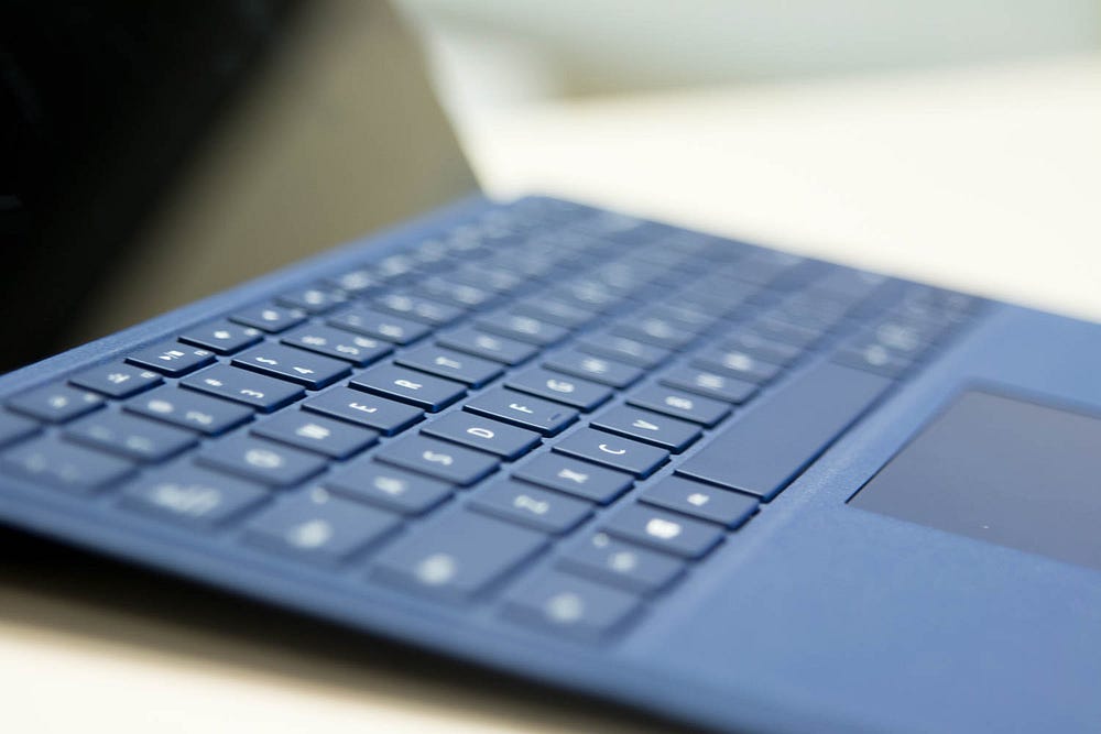
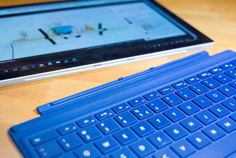
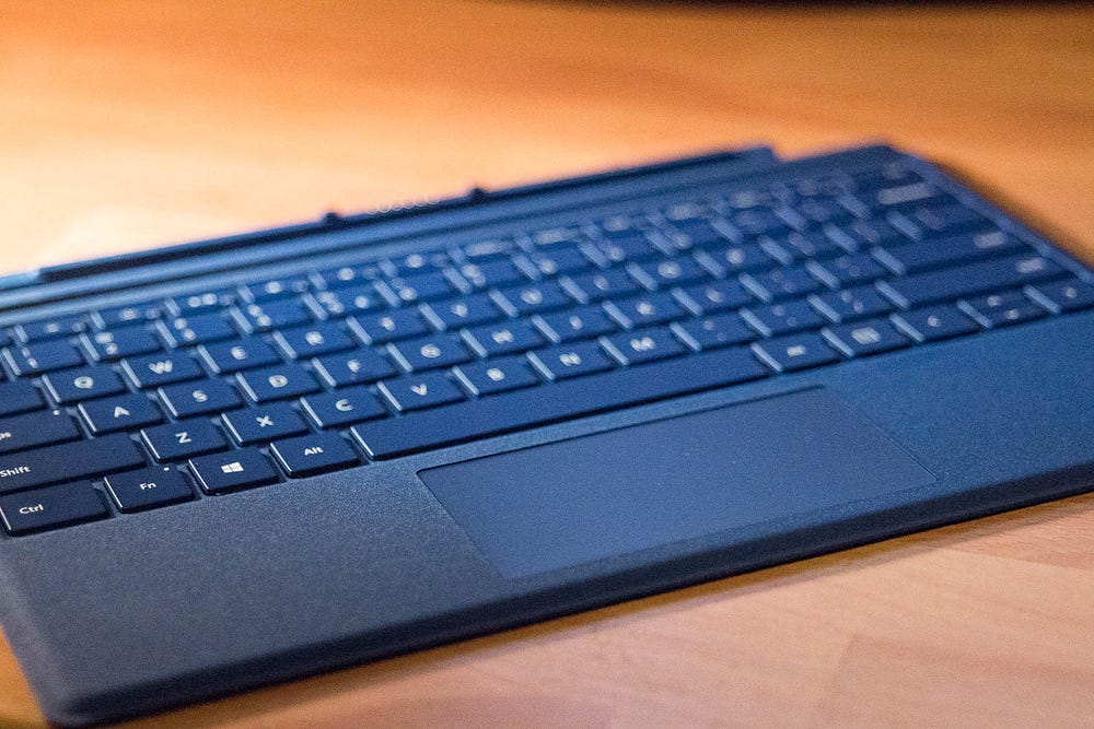
It’s not the level of an actual laptop, definitely not a Macbook keyboard, but taps away quite pleasantly!

Works pretty great for on the road, and for office/desk/home use, there is something even better:
+ Sculpt Ergonomic Desktop
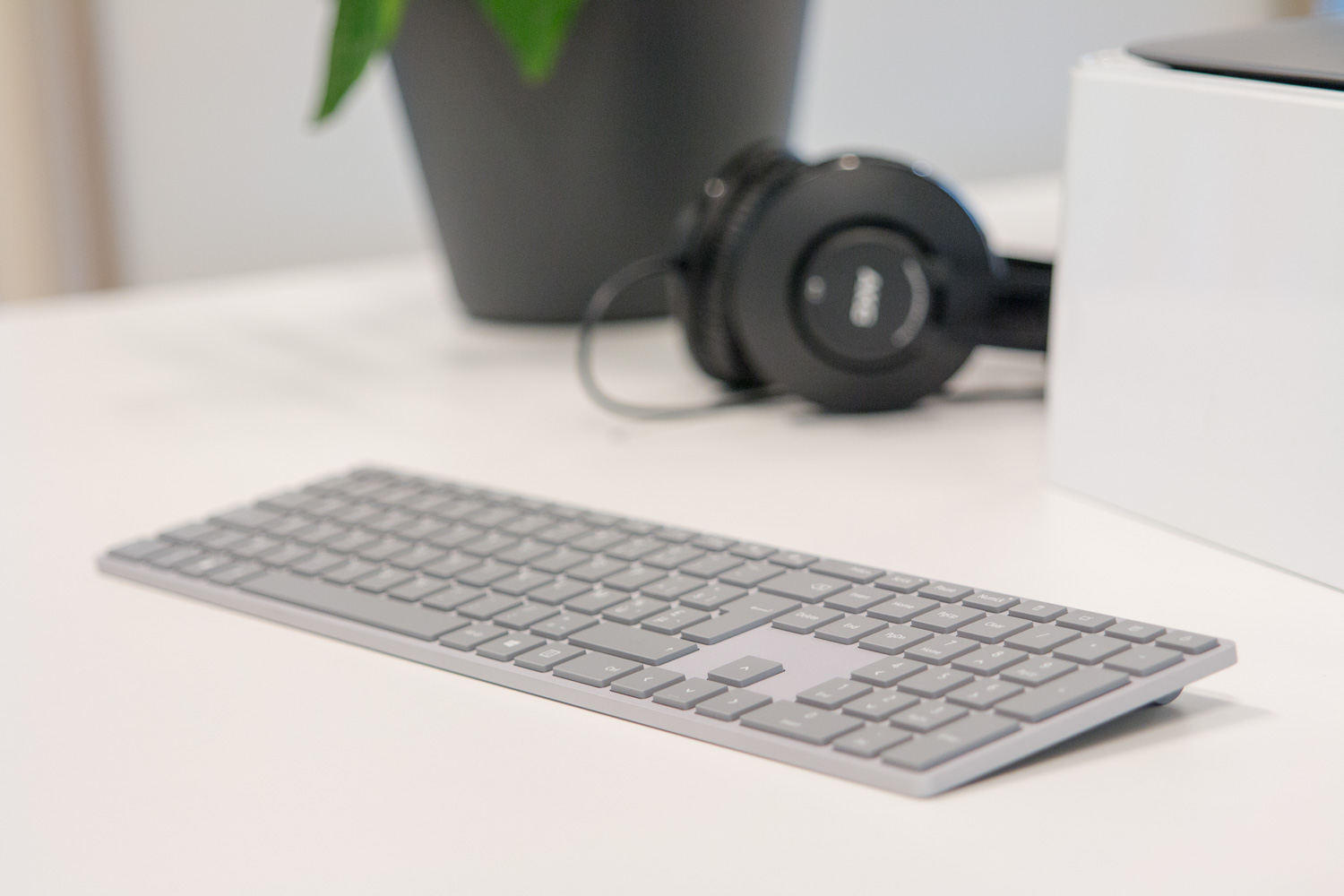
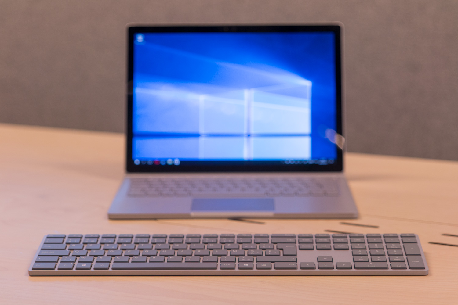
The Sculpt Economic is a keyboard and mouse set, also by Microsoft.
While the mouse looks like some weird shiny bird egg, the keyboard is gorgeous. It looks and feels the part, the wrist rest feels like everything should feel from now on, and the keys type and sound wonderful.
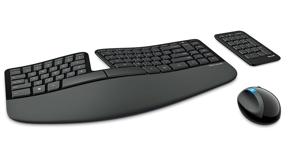
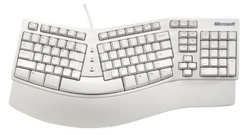
Back in the days, I rocked the Microsoft Natural Keyboard, so I have some experience with ‘broken keyboards’, loved it then, love it now.
I’m not a fan of wireless peripherals, but I gotta say, it cleans up the place.
Only thing missing: previous/next buttons! Why!
I flip through audio constantly. Almost had a winner, here.
+ Windows Hello — Logging in with your face
So get this, it uses the camera to detect my face and unlock the machine.
This is so great, I wish to have it on all my devices from now on.
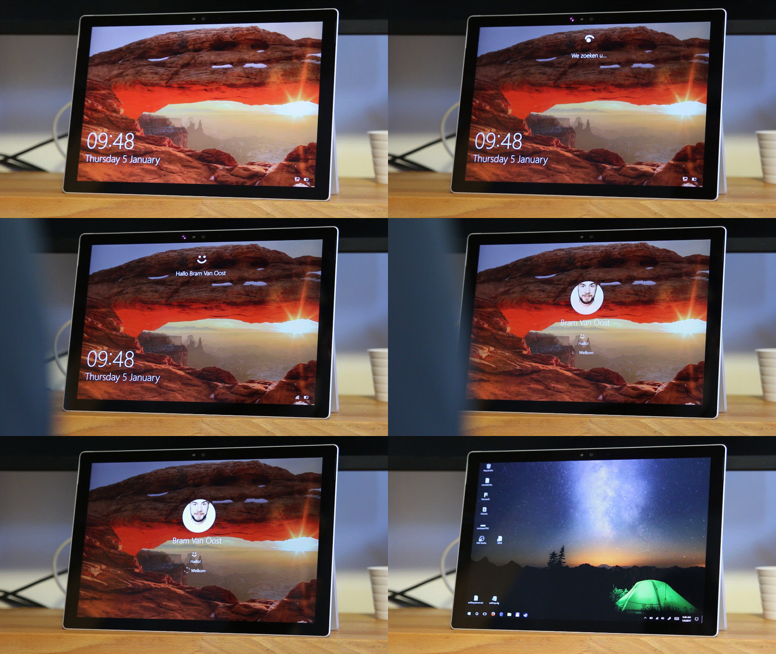
I know what you think: printing my face won’t work, it uses 3 different camera’s to scan the face: a default RGB, an infrared and a 3D camera.
Even better: they tested this system with… twins! And still it held up.
+ The cloud is with me, and I am one with the cloud
Using more and more cloud-based services results in increased plaform-agnostic working. Up and running in a matter of minutes:
- Google Drive: All of our company files instantly available. We’re moving from Pages/Numbers to Google Docs, so mostly no issues there.
We obviously try and stay away from Office, because Office. - Dropbox: For personal use and moving files around devices.
- Firefox: logged in with Firefox Sync, boom, all my settings, passwords, even plugins appeared like magic. Firefox, I love you.
- Spotify: All my tunes and playlists, setting up the rest with a jam.
- Adobe Creative Cloud: allows for 2 installs, entire suite ready to go after some downloading. Most importantly: Photoshop, Lightroom, Premiere and Prelude, and Audition.
- Ableton Live: also allows for multiple installs, cross-platform, done.
Pretty remarkable how fast you can get to a productive state, even on a semi-foreign OS.
Basically, just about all of the software I needed to do my job was up and running in a matter of hours, thanks to cross-platformness and increase in cloud usage.
– Setting up (Google) email is still shit.
Felt right back in the Windows XP age, where you had to pull all manner of animals out of hats to get Google mail accounts going.
- Mail, the built-in mail app, can handle Google accounts, but doesn’t work with my elaborate folder structure properly and has an auntie-oriented interface. Not for power users. Out.
- Outlook
STILL doesn’t support Google Mail out of the box, it needs Google Apps Sync, which I couldn’t get to install untill I reinstalled Office, that I installed an hour before. Fun on a stick!
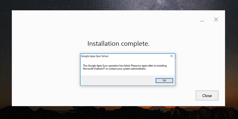
- Can only add one account through Google Sync, the others through IMAP.
It’s a restriction from Google, but that ‘s not a problem on MacOS Mail
Wtf is this, the middle ages? - No unified inbox. -___- Done with this.
- No sent messages in conversations. The hell?
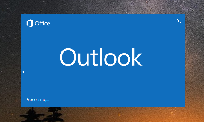
- Outlook didn’t open a number of times, getting stuck on ‘processing’, common problem, a fix was opening it with outlook.exe /safe.
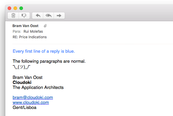
- When replying, MacOS Mail users get every first line… in blue.
Not the rest of the mail, no, just the first line.
Adding some color to my life for reasons.
Why, oh why, is email still so ridiculously shit? Hm? ಠ_ಠ
Why is supporting one of the largest email service providers on this planet still not a given?
Apple Mail does, perfectly.
(I hear Win users going mimi mi mi, mimily.)
This is not 2006, users and especially pro users want their tools working perfectly. This is why I switched to OS X in the first place — spend time getting things done, and not fiddling and fixing my main tools.
Also: search is a bit crap. Or maybe that’s just me.
And on a positive note:
Once it worked, I was surprised again at how fast one can work with Outlook. I practically live in my mails, managing 3 inboxes and hundreds of mails per day, speed is everything. Dragging mails into folders like some kind of email mad man.
Has much to do with interface handling in Windows in general:
+ Interface
I used to navigate warp 9.9 on the XP interface, unstoppable in combination with Total Commander. Significantly slowed down in MacOS, and even more over the years since they added all the animated BS, and prevented tweaking.
The fundamental UI of Windows has always been (besides that tile detour) remarkably faster than MacOS in terms of navigating, switching windows (alt-tabbing), window snapping, keyboard navigation, less animations and useless drop shadows, and I have to say, they still beat MacOS, hands down.
MacOS: alt-tab between damn windows, not applications, already >_<
+- Switching device mode
The fact that you can switch from desktop to laptop or tablet use is so neat.
I disconnect it, walk around, sit on the couch to read, make some notes, and instantly connect the type cover for laptop use on location or in my kitchen.
If you don’t need heavy gaming specs and love moving around, the Surface Pro 4 is an excellent choice.
Unfortunately, and this worries me, switching is not always very smooth:
- After reconnecting my display, it often doesn’t recognize my display’s USB hub, forcing me to reboot. Very annoying, potential deal-breaker.
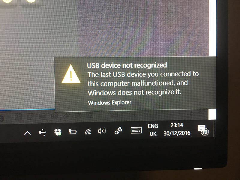
- I managed to crash it once after disconnecting the mini display-port while it was scanning for Bluetooth devices (not sure if the combo is relevant).
- It messes with the interfaces of non-UWP apps, like my frequently used Lightroom, opening it on the Surface first, and switching to my big display.
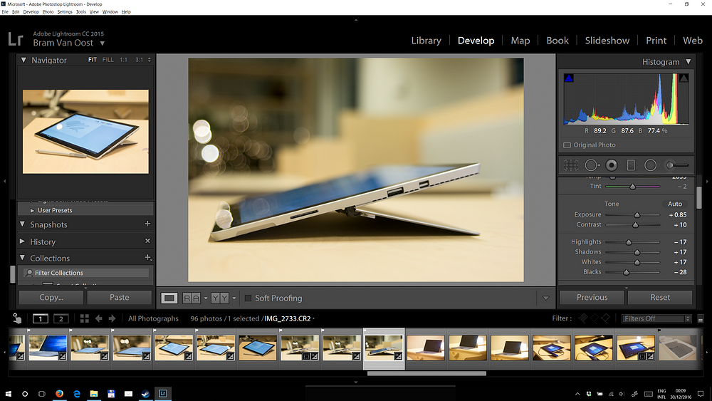
- Just now, after disconnecting to take some pictures of the magnetic connector, Spotify made no more sound (even though play/pause works), and is refusing to start now after an exit.
+ Gaming
Windows! Games! Right? Even on this ultra-thin Surface Pro 4?
It’s not intended to be a game machine, and yet it runs games better than on my 2014 maxed out MacBook Pro. Well done, there.
Finally kicking minor ass in the old Call Of Duty — Modern Warfare 2.
I’m not a gamer gamer. so this was enough win for me.
I thought, when in Rome, and installed a few of my old favorites: Soldier of Fortune II and Unreal Tournament 2003. And there are people still playing! ❤
What I missed from macOS
- Proper email client — I always considered Outlook to be one of the best email clients out there, but Apple Mail simply gets the job done, even with those !@# animations, where Outlook falls short quickly and hard.
- Hot corners for quick overviews and window switching.
But alt-tabbing in Windows beats the one in MacOS, hands down. - iMessage — Rich texting, cross-device, it’s so convenient, and such a pain in the lower back area when it’s missing. Ask anyone who’s used to it. (And no, bloody WhatsApp is not an option.)
- Preview — the space bar, has become such an inherent party of my life, even flipping through files, closing preview and having that file selected. No such thing on Windows, slowing things down (too) significantly.
- Time Machine — Although there is Backup and Restore, which makes (timed, if you want) system images. Not quite version control, but I guess this is enough. I love knowing that I have several drives and cloud volumes taking incremental backups continuously, and these have saved my rear many o time.
- Keychain — I use it frequently to keep tabs on, or retrieve accounts, and store encrypted data. I don’t believe Windows has this kind of system, but am ready to be proven wrong, fan boys.
Probably impossible super-wins for power users on Windows
- Preview. Copy it. You have my permission.
- Rebuild Outlook with proper account support, and as part of the default OS package.
- Fix the hardware support glitches. If Apple can do it, so can you.
Very likely impossible super-wins for power users on Mac
- Have a pro edition of macOS that focuses on speed, UX, and eliminates all shadows, animations and eyesores, so the pro’s can be pro again.
- Have a pro email client with the Outlook interface, and the Mail engine/account support.
(don’t you dare mention the monstrosity that is Outlook for Mac) - Copy that face authentication, bloody awesome.
TL;DR
A really impressive piece of hardware. Switching device modes is mostly great. The Type Cover taps pleasantly, face recognition authentication should be everywhere, using email is remarkably still shit, the Sculpt keyboard is almost amazing. The speed of the UI beats MacOS. Windows 10 is… okay. Workable.
If this device had more power (couldn’t handle Lightroom and Premiere very well), an extra USB port, and the email bs would be solved once and for all, this would be a workable professional and personal workstation for me.
But no, I’m not switching. Yet.
From either perspective, what are your thoughts on Apple’s choices lately?

